


Input
These Finnish bakers have been around since the 17th century. And unfortunately their identity certainly looked that way. It was time to update the look of this slow-food brand.
Output
Output
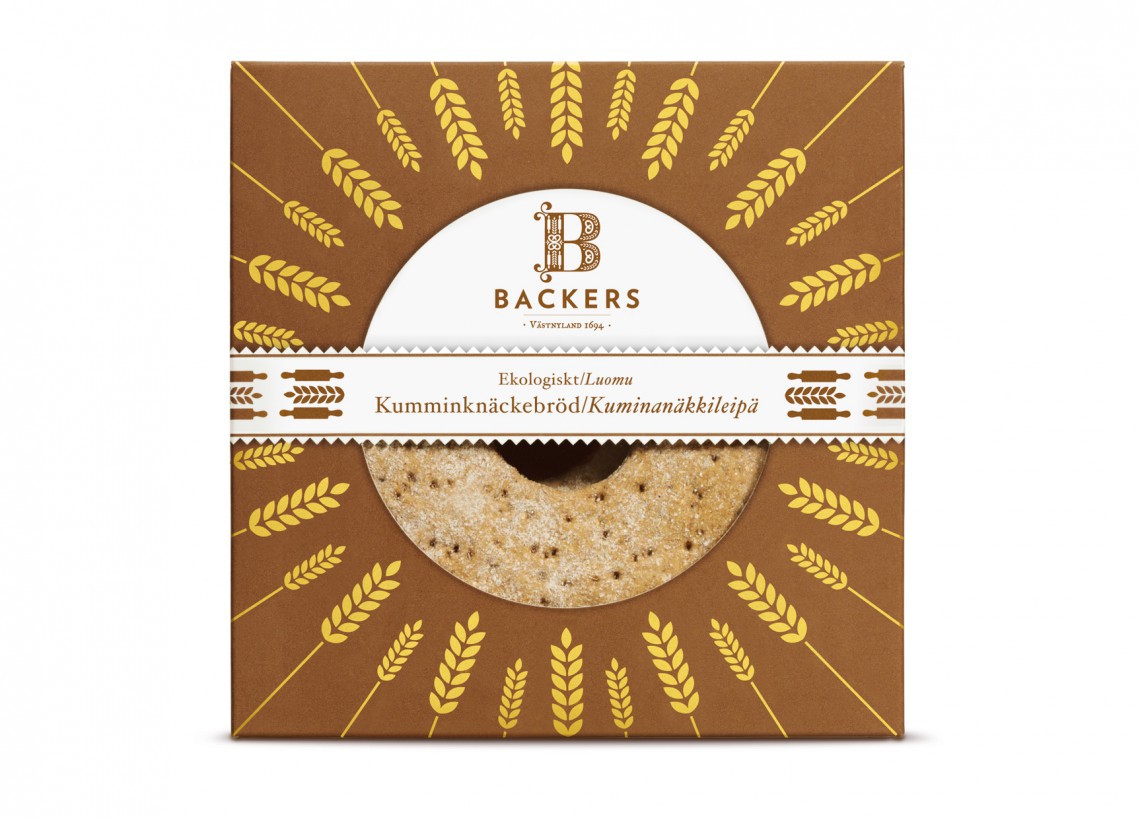
History showed us the way. In the tradition of folk art and woodcarving we filled the initial B with baking and farming symbols. A type of ornamentation that also comes back in other parts of the visual identity and in all communication and P O S-material. Another important ingredient in the overall identity, and the packaging design, is the pennant-shapes that make you think of ancient banners from the days when Backers was founded.
Designed at Neumeister
–
Copyright: Neumeister Design
Creative Director: Peter Neumeister
–
Neumeister Design, Stockholm

